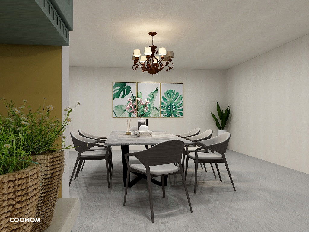
This is one of my favourite dining rooms I have actually designed as I feel that all elements added into this room complements each other very well.
This is one of my favourite dining rooms I have actually designed as I feel that all elements added into this room complements each other very well.
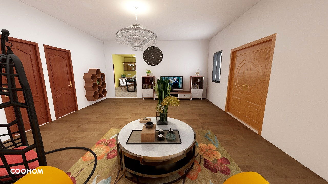
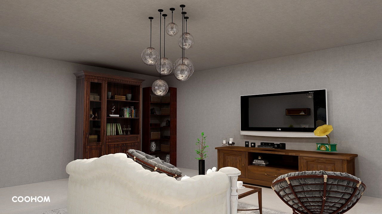 This is another interior design done and this is suppose to be the living room. I decided to use whites and browns in this living room as this also gives a homey feel to it. I added some lights that has different lengths and sizes of bulbs to make the living room have an edgy look, also to better enhance the room better with the furniture.
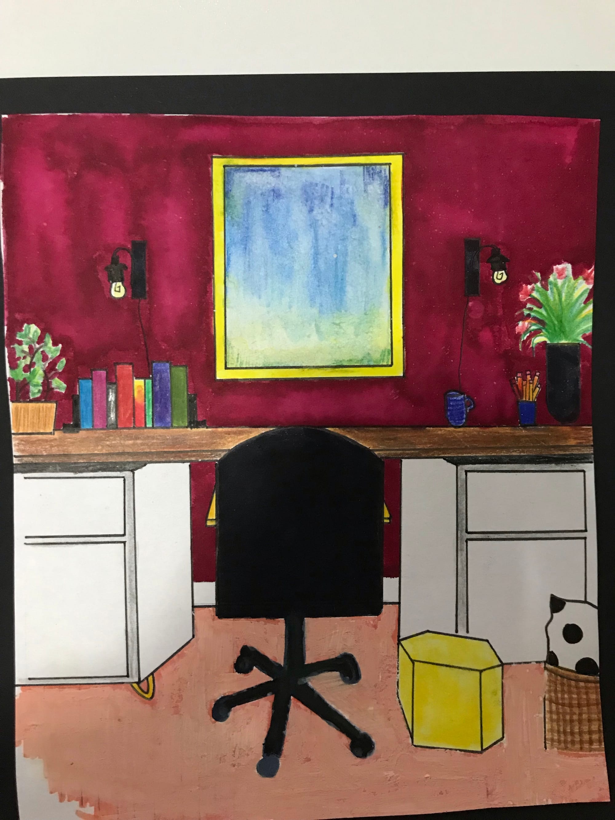
This is one of the interior design I have drawn and done from scratch and this is suppose to be a study room. I used a wide range of art materials like paints, colour pencils and markers to complete this; also a variety of colours to make the study room more vibrant and colourful, which will help one work, study and play better in this space.
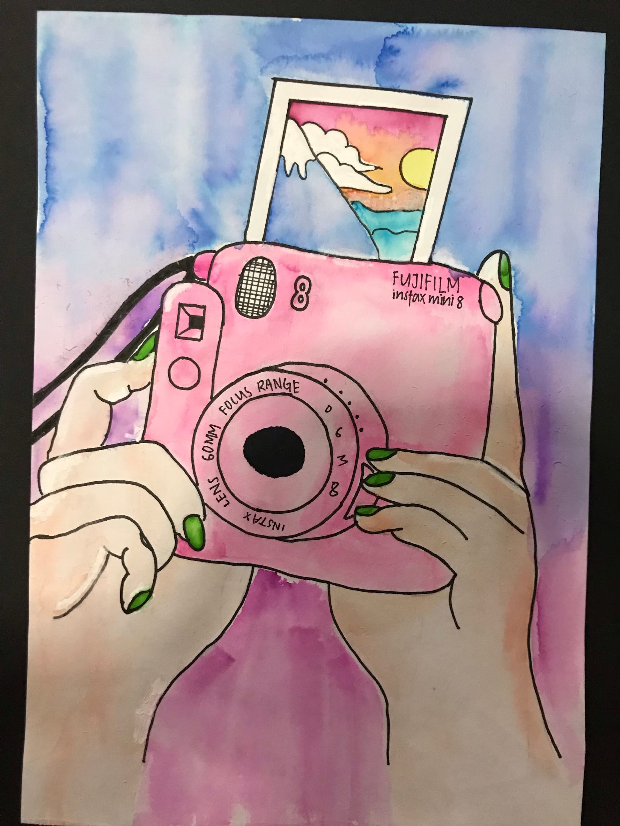
I used water colours to colour this art work. As polaroids are usually represented with memories, it reminds me dearly to appreciate every moment spent with my loved ones.
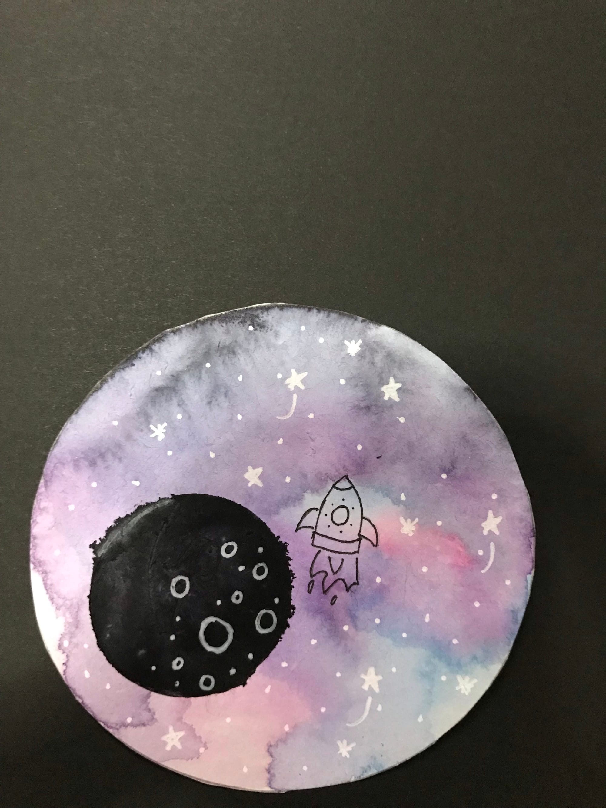
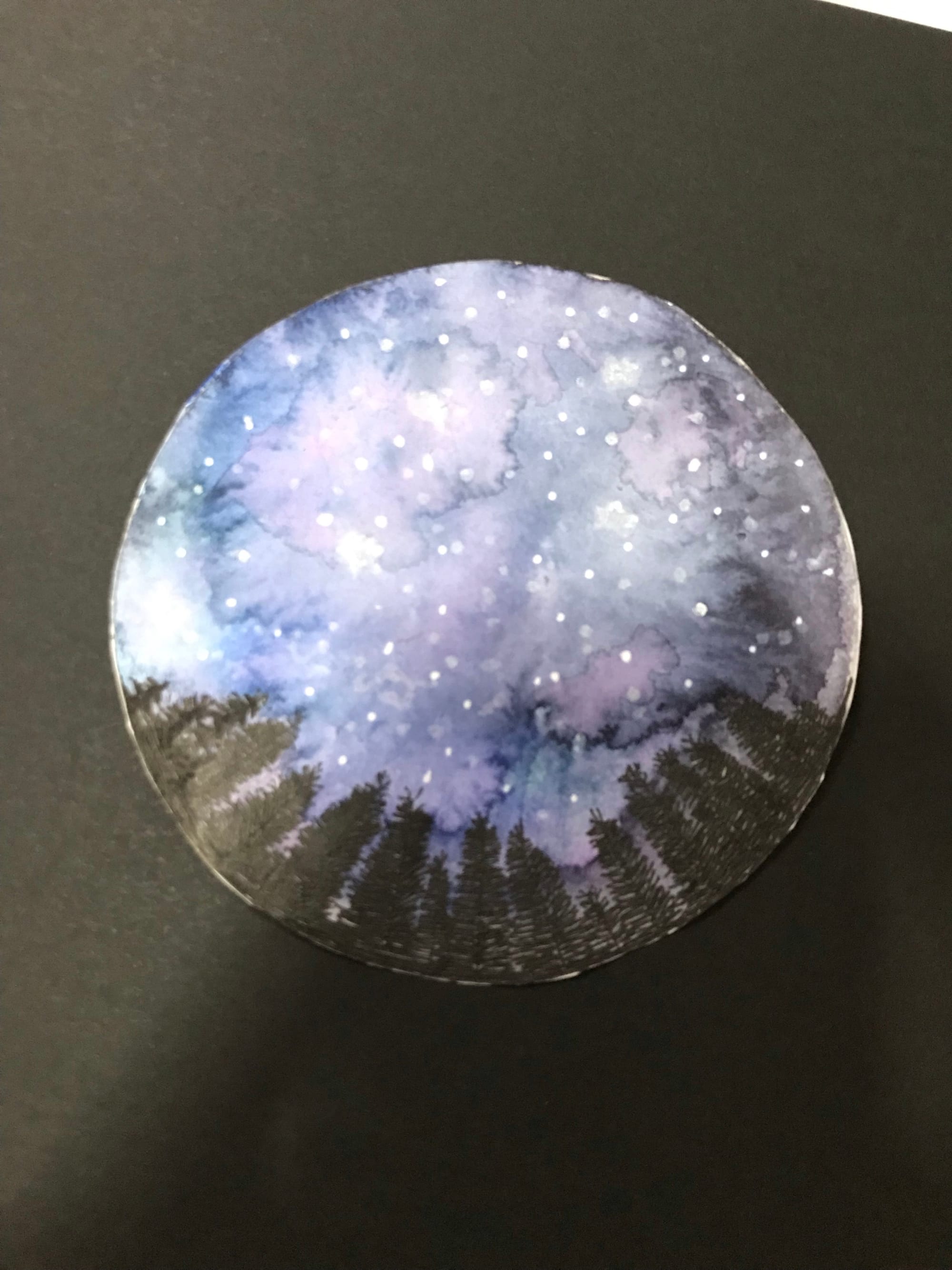
I enjoy watercolouring in my free time as I feel that it is extremely satisfying. Here are 2 of my favourite art works.
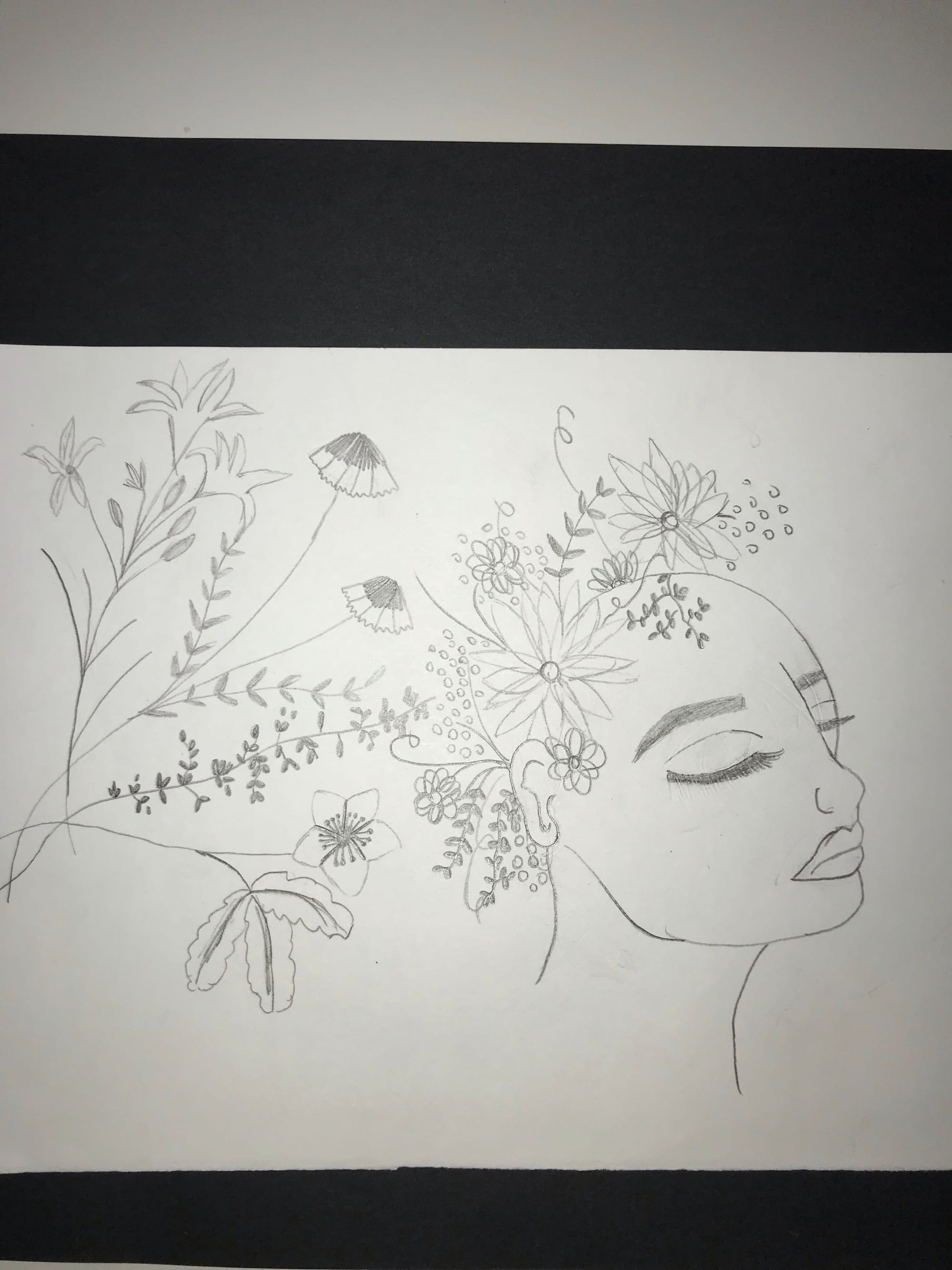
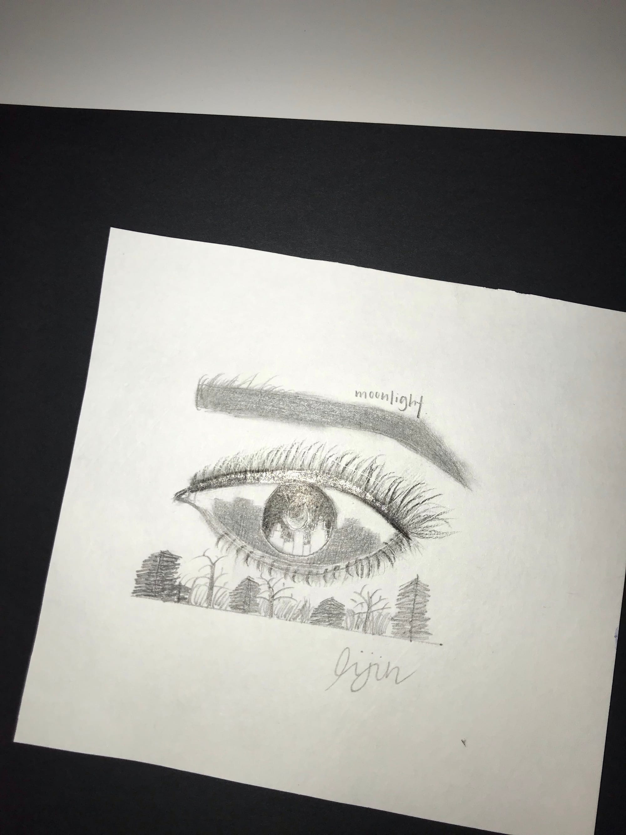
I honestly enjoy sketching in my free time and I do love sketching flowers as it always remind me of my favourite quote: " As flowers bloom, so does hope.". This easily motivates me when I am starting to lose hope and it also enables me to relieve stress. I also do some shading too.
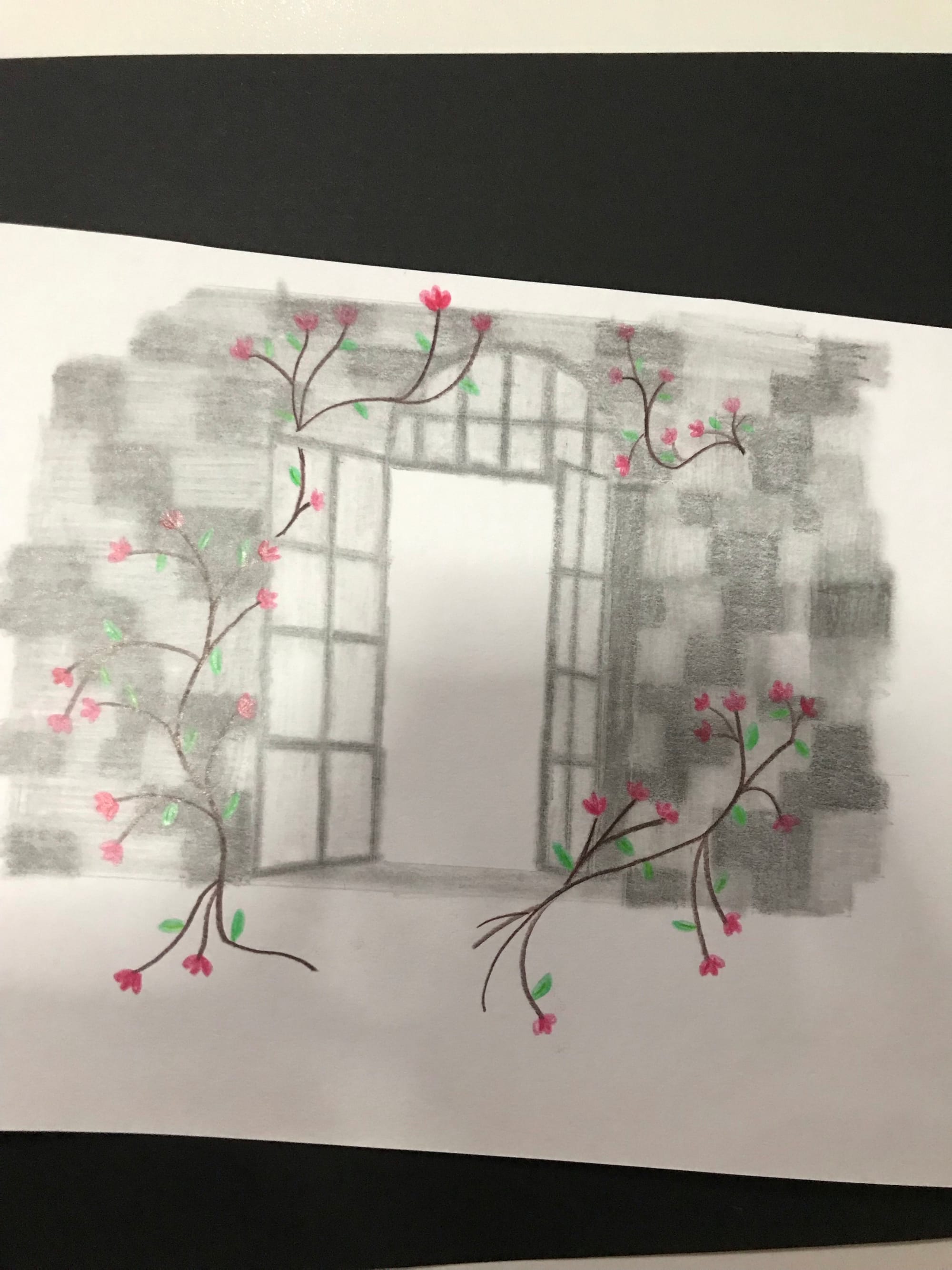
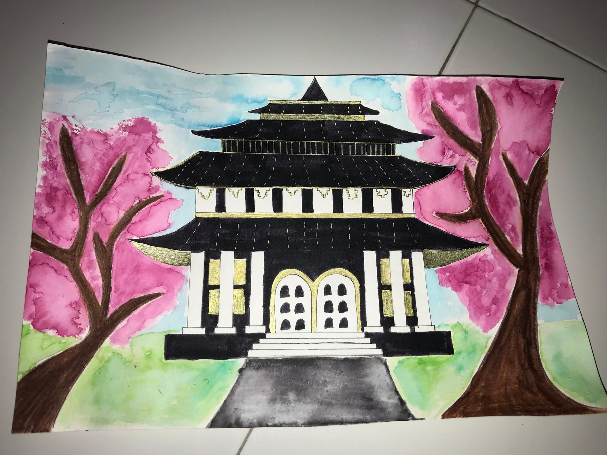 I have always admired and enjoy details of Chinese and Japanese temples. Hence, I drew a temple and water coloured some flowers at the sides to better enhance the temple better.
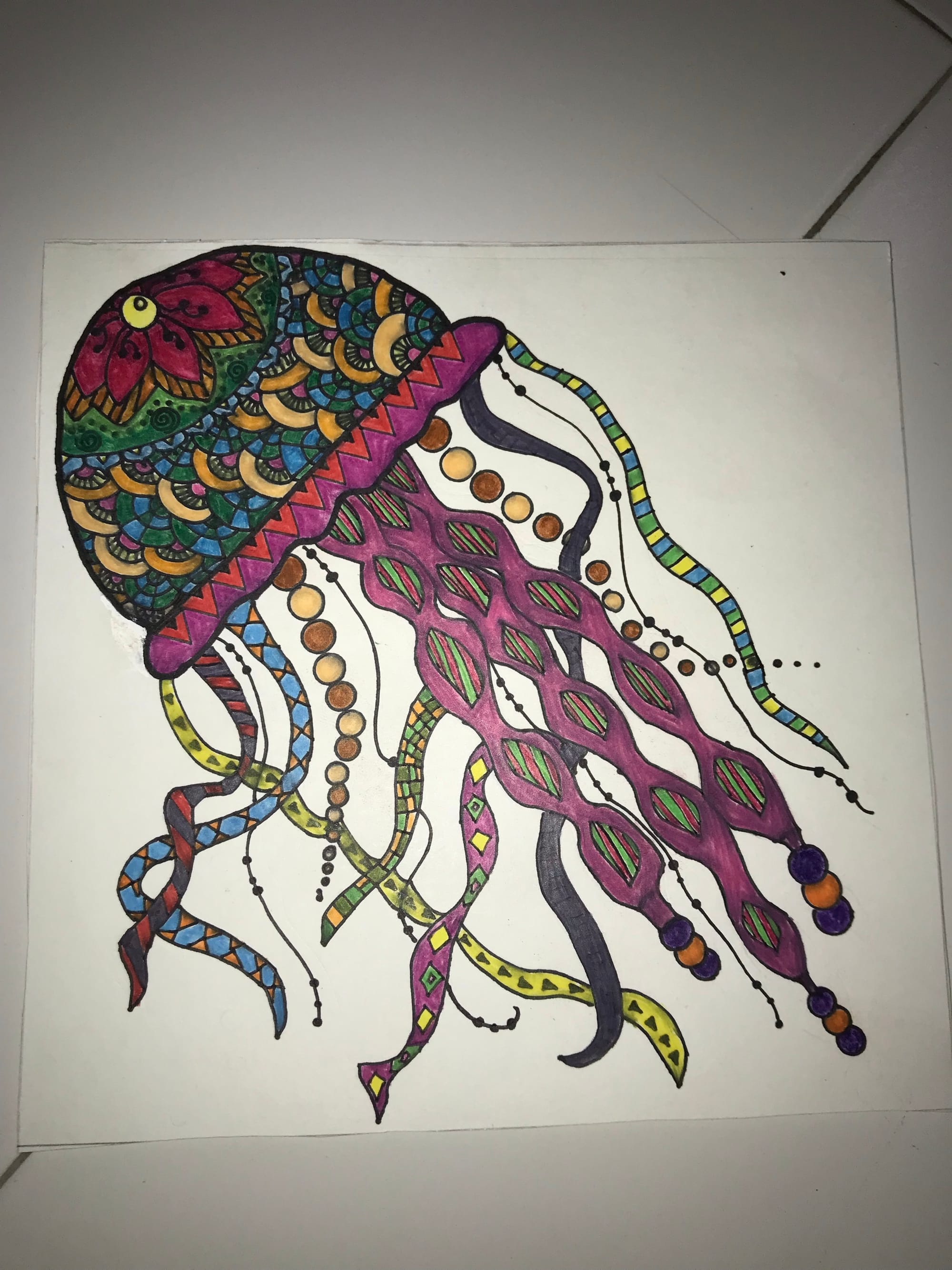
When I am stress, I always draw zentangle related art as it helps me relieve my stress and I do enjoy drawing patterns and colouring. I am proud of this art work as it took me 2 days to complete this artwork.
One of my interior digital design.
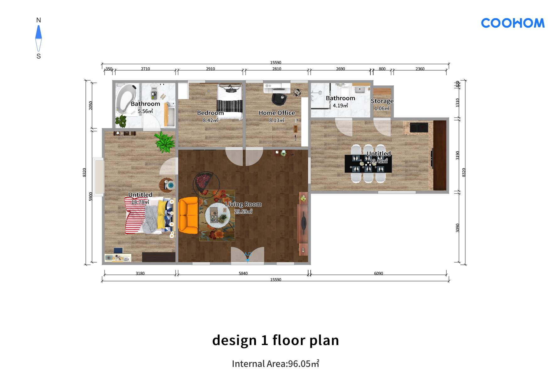
This is one of my interior design that I've personally designed myself. This floor plan of this is the picture above and it is based on a Singapore typical 4 room HDB flat. I used the coohom website to bring my vision to life.
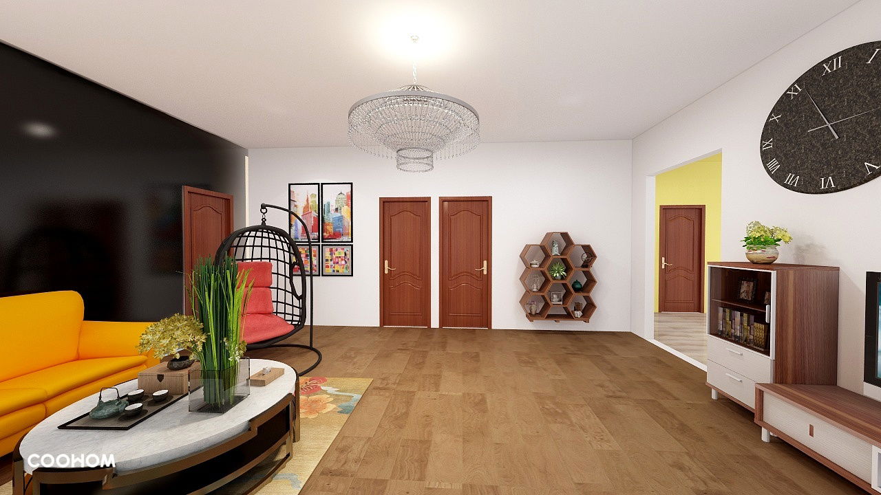
So, I decided to go with warm and vibrant colours as colours appeal to people and the colours I have chosen (like brown and oranges) give a sense of hominess. I used black for the wall as it enables the attention to be averted to the furniture placed in the living room and it tones down the brightness of the furniture placed there.
 This is the view of the living room from the sofa. I used a floral and warm colour themed mat to match with the hanging chair placed on the side and the sofa.
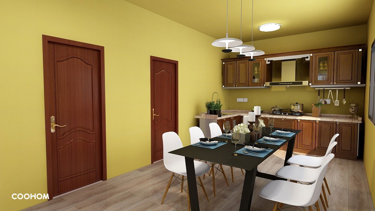
As you proceed straight, you'll reach the dining table and the kitchen of the HDB. I feel like yellow is a great colour to use in the kitchen as yellow is a colour that stimulates one's appetite and also yellow matches the theme of the living room, which is warm colours. I added some decorations like plants to make the kitchen more colourful and more vibrant. I also used neutral colours for the dining table and the kitchen cabinets as I feel that brightly vibrant colours matches best with neutral colours.
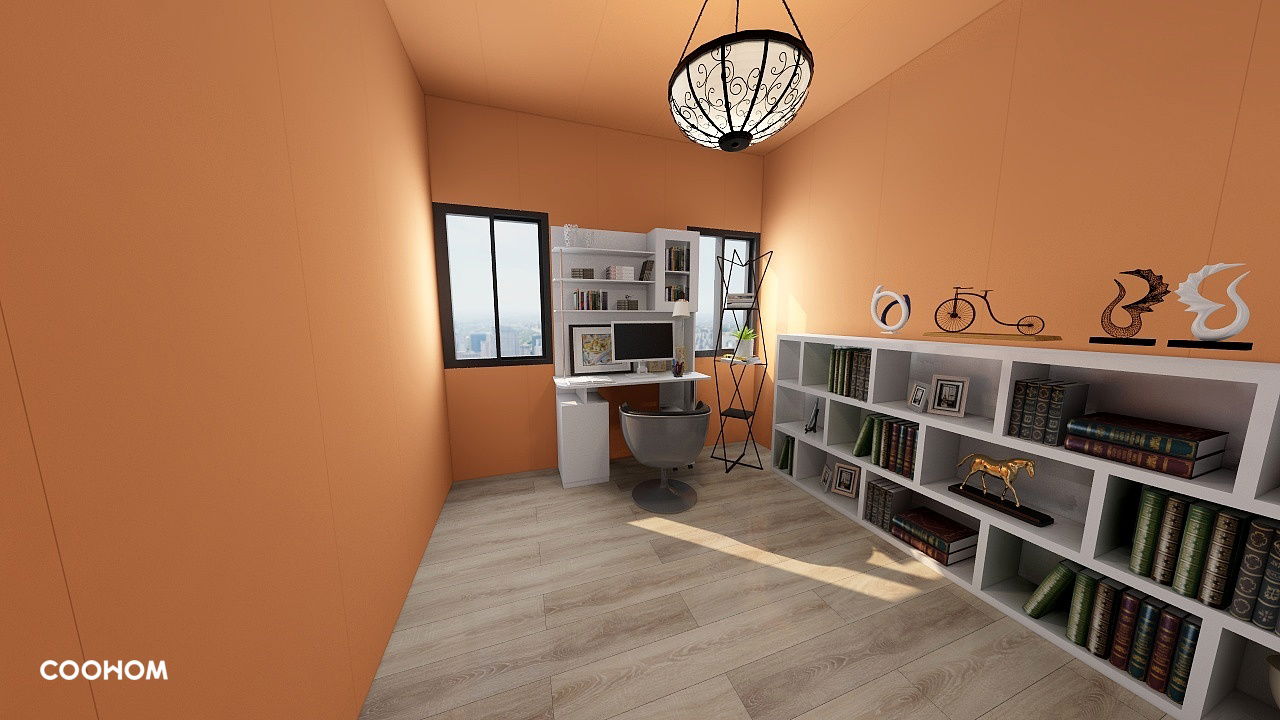 This is the study room I have designed. I choose the have the table near the windows as when one is feeling tired take can look out of the window to take a look of the scenery. I choose orange for the walls as orange is a colour that enable's people to be more productive while studying or working. Also, it matches my theme of warm colours being used.
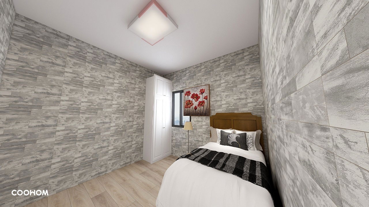
This is on of the bed rooms specially designed for guests. I decided to go with greys in this room as the other rooms are colourfully designed. I used white and browns to match with the greys. I initially thought the room was rather dull, therefore I added a lamp and picture with red flowers to make it more appealing.
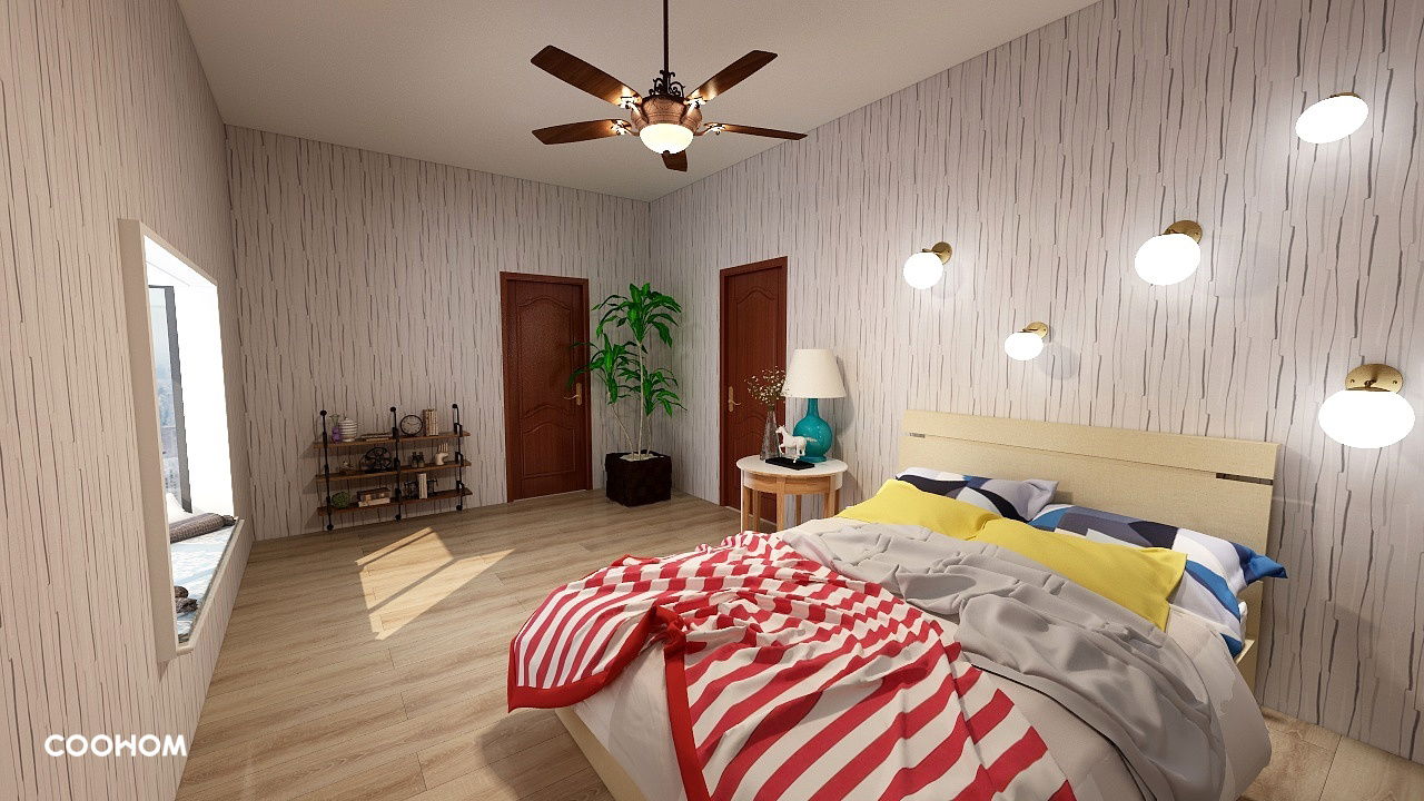
This is the master bed room. I used vibrant colours in this room to added a few lights of different sizes to better enhance the room and also to make the room more edgier. I added some shelves and a plant to add more colour into the room and make it look a little more livelier.
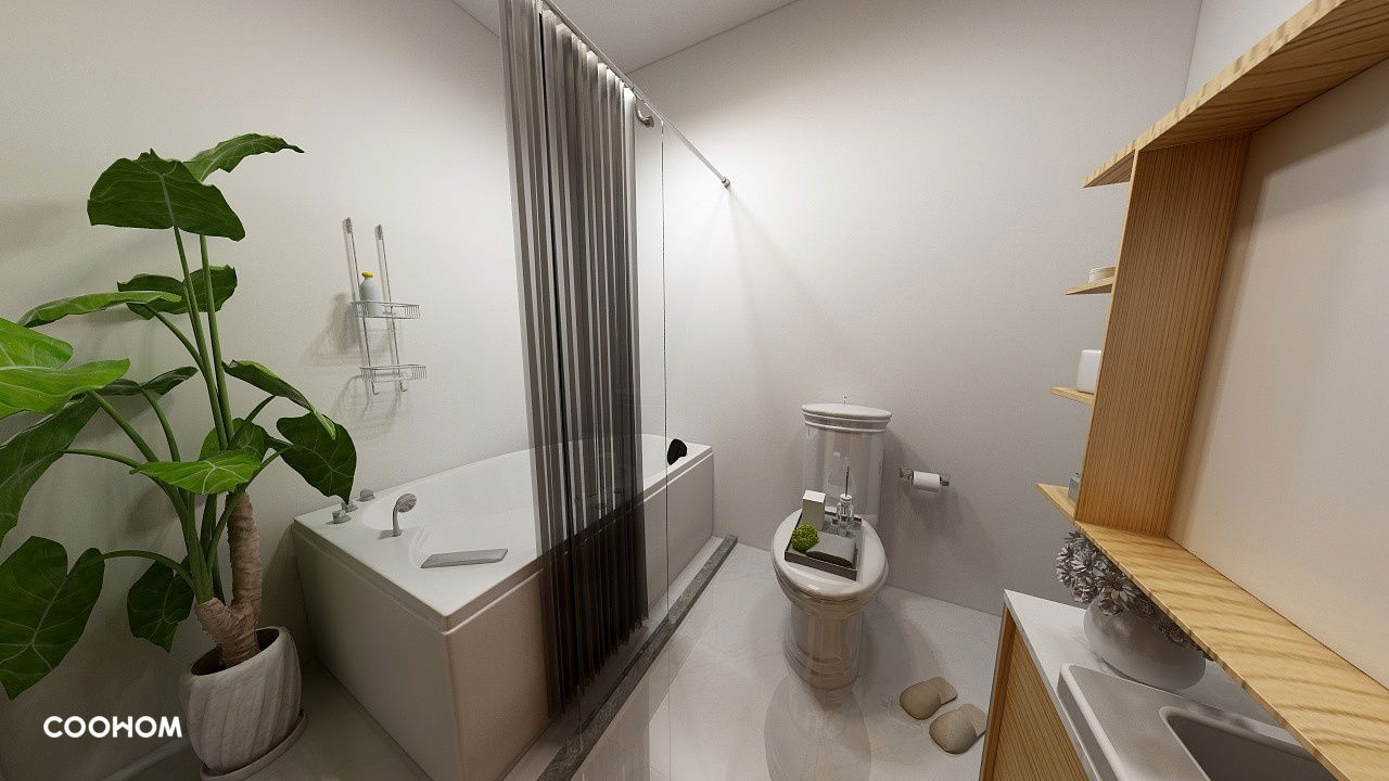
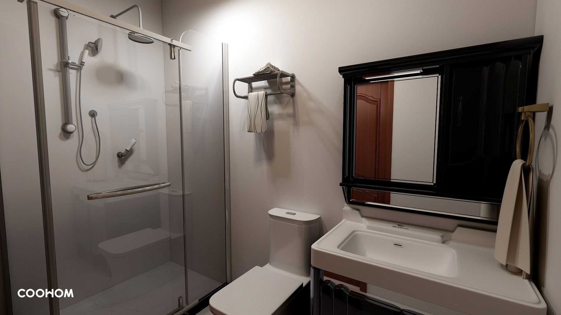
These two picture showcases the two toilets I've designed. I decided to go ahead to use whites in the bathrooms as it is a basic colour used.
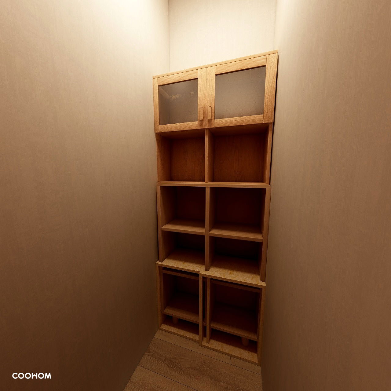
And here's the store room. The store room is rather small but I added some shelves in it so the people living in the flat can place their household items in this room.


